 Site Explorer
 Keyword tool
 Google Algorithm Changes

Who has the greater armor? Is it the Super Mobile App or the Mobile Spider Site?
In today’s market, it is (almost) impossible to hang in there without a mobile-optimized website. It’s 2018, we are talking mobile. There’s no need of much research to find out that mobile has become extremely important. Just look around you; everybody’s looking in their phones.

Considering the big influence mobile is having, Google has taken several actions to support white hat practices and mobile activity (but also to poke the practices that aren’t up to date). Mobile first indexing is the new trending topic. We’ll talk about that too, but what we’re trying to discover is which one has better deliverability in terms of ROI and conversions: mobile phone app vs. mobile-optimized websites.
- Where Does the Revenue Come From: Mobile App or Mobile Site?
- Mobile App vs. Mobile Site: Advantages and Disadvantages
- Great Examples and Tips for Using Mobile Apps in Your Business
- Valuable Insights for Optimizing Your Website on Mobile
- Does Mobile First Indexing Influence ROI?
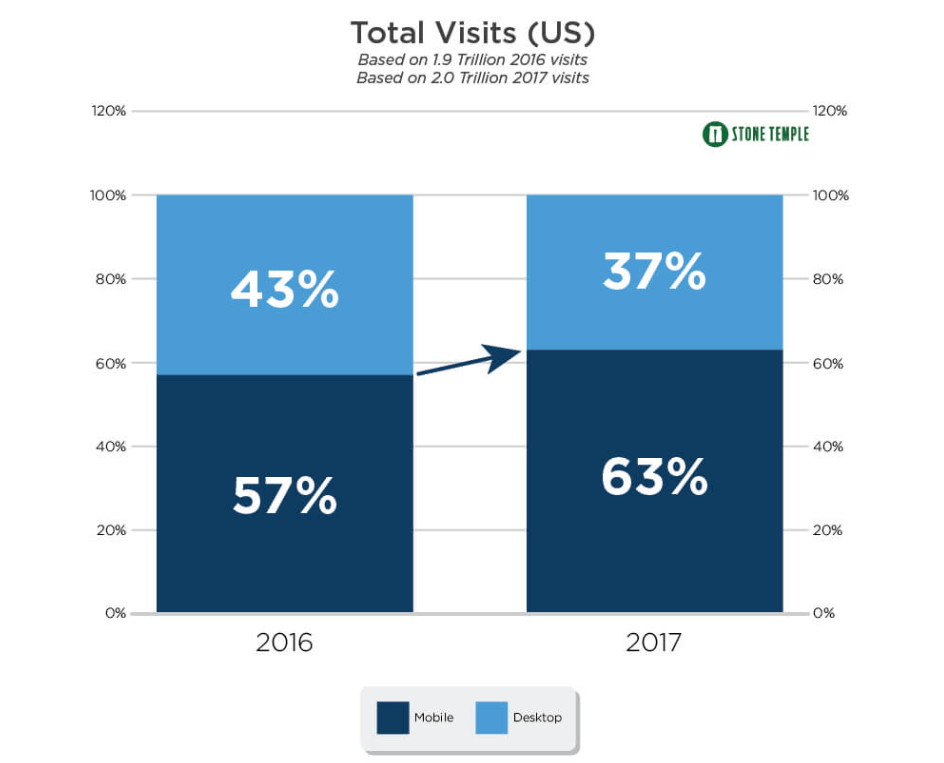
To understand the importance of mobile usages whatsoever, we’ll have to take a peek at the studies. The insights you’ll get are juicy! In 2017, a research made by Stone Temple showed that 63% of all traffic in the US was from mobile devices and only 23% was desktop traffic as you can see in the next screenshot. And that’s not all, 30% of shoppers used smartphones more frequently to find what they wanted in 2016.
1. Where Does the Revenue Come From: Mobile App or Mobile Site?
Before getting in the whole battle of who’s better than who, we’ve scooped the internet for some stats to understand the dimension of each side.
In 2016, the global mobile app revenue was $88 billion and it is expecting to rise to $189 billion in 2020. On the other hand, the global in-app purchases were 27.8 billion in 2016 compared with 32.9 billion in 2017.
The tendency is experiencing a rapid growth in the mobile applications industry.
Compared with mobile websites, we saw that the numbers were a bit smaller. By the end of 2017, over two billion mobile phone or tablet users made some form of mobile commerce transaction. In the same year, only in the US, mobile eCommerce revenue accounted for 50% of total eCommerce revenue.
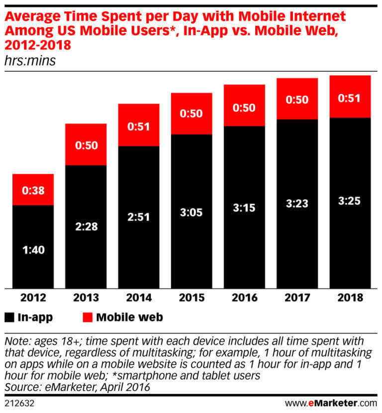
A decisional fact of these results comes from time spent in the app versus site. From 2016 to 2017, the time spent on mobile per day has increased by approximately seven minutes, reaching a total of 3 hours and 15 minutes.
From the chart below, we can see that only in 2017, the time spent by mobile users was two minutes and the time spent by app users was almost 4x higher. An estimation for 2018 shows a slight increase.
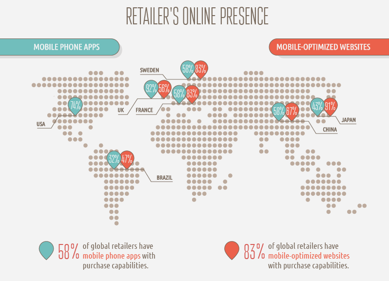
The online presence is overall higher on mobile-optimized websites than on mobile phone apps. And they are winning also at the purchasing capabilities. 83% of global retailers have mobile-optimized websites with purchase capabilities compared with 58% for mobile phone apps. The purchase capabilities from the study were the ability to check product availability online prior to going to the store or find information about stock availability, or the ability to order out of stock items via mobile phone.
Source: love.shopping.fm
If we were to say, it appears that there is a strong battle between these two, but mobile phone apps might experience a higher opportunity to bring better ROI.
2. Mobile App vs. Mobile Site: Advantages and Disadvantages
While native mobile apps might not be so relevant for all businesses, mobile-friendly websites are more important. But which is the best option? And what should you choose?
Mobile Apps advantages:
- Mobile phone apps generate a lot more revenue than mobile optimized websites;
- Better user experience and personalization, which means more flexibility to have a user account and save preferences; they load faster, offer personalized information and have better accountability of their activity to make them accomplish a specific action and convert.
- More control over the information, providing more features and maxing the most out of them;
- Ease of use and convenience, since native apps are installed and you can access them so fast. Also, the design of mobile apps fits different screen sizes more elegantly than websites and are more fancy looking.
Mobile Apps disadvantages:
- Different programming languages. It is a more complex development process which requires skills to account for different screen sizes across devices for lots of platforms and have a good mobile application in the end.
- Different optimization for each operating system (Windows, iOS and Android). It requires great compatibility and it gets even more complicated for Android app development since there are many versions of Android currently out on the market. If it doesn’t function well, the user could easily delete it and you can lose them forever.
- Higher costs and higher maintenance: An app design for multiple operating systems and higher programming languages means higher costs and higher time to develop and correct the issues. A mobile app requires a “polish” every once in a while because there might appear errors more frequently.
- Harder to optimize for SEO. Since it’s created for mobile entirely and promoted through Google Play or Apple store, it’s harder to optimize it for search engines. This leads to almost no organic traffic.
Mobile sites advantages:
- Simple development at lower costs. In contrast to native applications, mobile websites are cheaper because they don’t require so much programming language to any different implementations due to the different types of the platforms and operating systems.
- Broader Audience. Due to the high flexibility on multiple devices and no limitations on different types of screen either, it’s easier to access a website from a broader perspective compared to a native app.
- Higher flexibility on updates: Doesn’t demand to the user to accept any changes (upgrades, updates or any of similar actions) like a mobile app requires from the user. The mobile site is more flexible on this matter. After the updates are implemented they appear live and can be very easy to access the info on site.
- Mobile sites and responsive websites (they are 2 different things) have the possibility to generate traffic and even boost it.
Studies from iAcquire and SurveyMonkey showed that if your website pops up in a search engine query, and it isn’t mobile friendly, 40% of online users will go back and choose a different result. Not to mention that Google is prioritizing responsive websites higher in query results since 2015 and Mobile first indexing is running. If you don’t like higher results in Google, then I might understand the need to avoid mobile responsiveness.
Offspring, a U.K.-based sneaker company, has adopted the responsive design and had a 15.19% increase in mobile/tablet conversion rates, plus a 102.58% increase in mobile/tablet revenue year on year.

On the same topic, Blazing Saddles, a business that offers cycling tours in New York City and San Francisco went responsive. And after their website was live, the mobile and tablet traffic increased by 74% and all traffic to the site grew by more than 40%. Search engine optimization also helped the site stand out and attract more visitors.

Mobile sites disadvantages:
- Smaller compatibility: Even if you create a responsive website, you will still encounter issues on the different screen sizes because it will adapt differently to every screen resolution and you might not be able to find all the information and functionalities that are available.
- Offline availability. Comparing to a web app, the mobile sites can’t be accessed without internet. It may work offline though cache, but the pages will have fewer functionalities and it won’t be user-friendly at all.
Based on the whole pros and cons parade for mobile phone apps and mobile sites, it’s up to you what choice you make. It depends on the needs you have and on those of your users. Try and see if a mobile app could help you achieve better ROI or better engagement, higher conversion, and sync them with the goals you’ve established.
You don’t have to make that decision now, bear with us. There are some more insights to gain. Check the next points 😉
3. Great Examples and Tips for Using Mobile Apps in Your Business
To create great mobile apps you should know when it’s the best time to do so. A mobile app would be very valuable:
- when you need to process complex actions and calculations.
- where you can create a user account and want to save credentials so you don’t have to log in and log out everytime you want to check information in your account.
- when you want to run banking operations.
- for daily usage.
- for setting regular reminders.
All the mobile apps developed require more advanced programming skills, that’s why we thought about some tips for designing better mobile apps. We want to help you implement and make best performing apps if that’s what you need.
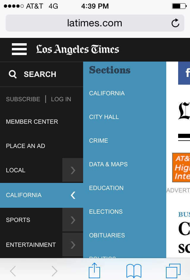
The first thing you should think about is placement and navigation. It is very important to have accessible navigation, placed in the same spot, never hide it or change its position because otherwise the visitors will be confused and leave.
Below you can see an example of good navigation on mobile phones. You can access the menu form the left side, and see all the categories, without leaving the page you are on.
The second tip would be to optimize your application for multiple operating systems: Android, iOS and Windows. If your application does not address a particular segment of users that are affected by the previously mentioned, then you should make your app accessible for everybody. Otherwise, you might risk losing an important part of your future clients.
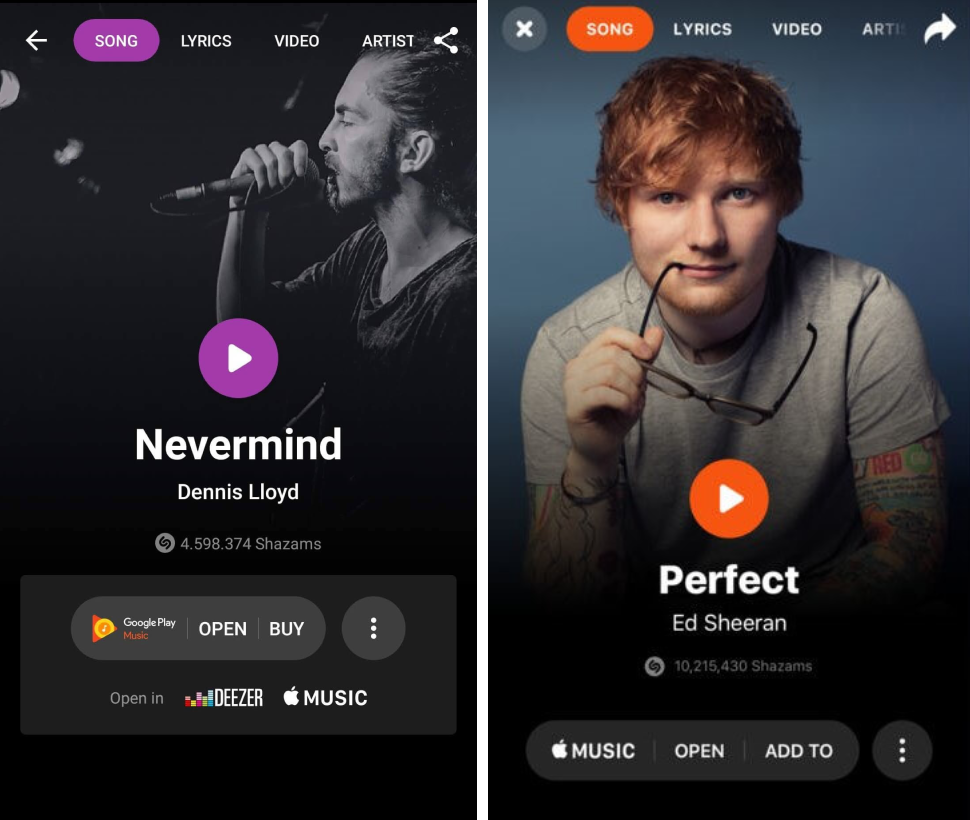
If you take a look at the next screenshots from Shazam, both on Android and iOs, you can point out some differences. On the left side is the version for Android and on the right side the version for iOS.
Also, make sure you optimize for different screen sizes. There are lots of screen sizes even for phones and designers should always try to keep UI elements constant for all the available screen sizes. Start with the smallest screen and then design the bigger spaces. Not to mention that with the new smartphones design these days, there appear other questions that pass the size issues. Take a look at the new phones with a notch.

Make sure you have one task and one screen. It is very easy to lose our attention, so making the space on the screen as efficient as possible is a must. Try and design an easy way to follow the workflow. Don’t overwhelm the visitors with lots of actions and buttons on each screen/step of the application.
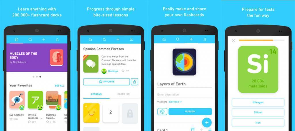
Duolingo is a great example of easy UI. Each step is placed on a screen, you need to finish it to go to another mission. You have interactive cards, simple design, flat buttons without any flashy messages and notification popping on your screen. Everyone who is using the app to learn a new language understands the simplicity of it.
Perform tests at different mobile internet speeds. It is better to have a faster and simpler app than a slower and more complex one. Make sure that your app works on slower connections too in order to ensure a good experience. Also, check and see what happens when the app loses the connection. Does any message appear or the does the image freeze?
Another crucial tip when designing a mobile app is to use legible fonts. A rule of thumb is to create text that is least 11 points so it’s legible at a typical viewing distance without zooming.
Medium has an amazing phone app that observes the font size and legibility very much, which is highly important especially for a blogging app.
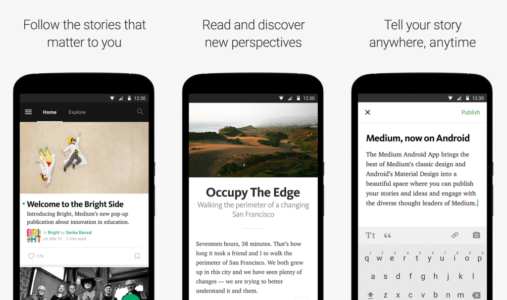
It is easy to look through the app, to write, read what you want and find stories that interest you. The size font and line spacing makes the text readable and not exhausting.
4. Valuable Insights for Optimizing Your Website on Mobile
When you decide to design a mobile website, the commitment to create the best website must be high. You need a plan that could help you along the way. To optimize your website on mobile you need to take into consideration the next insights:
- Determine what content is essential to the user. Prioritize and put the most important content first;
- Keep only the relevant content. Since it is a small screen, you should keep on site only the information that is relevant.
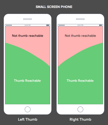
- Make the information reachable with the thumb. Remember the thumb rule. Even if phones have a small screen, not all of it can be reached. Smartphone users use the thumb for scrolling, tapping and searching for information.
- For a more complex website let users navigate to additional layers of content. Add menu and a search bar to help them get to the desired information.
- Test your website to see if you have any errors and check the loading speed time to get some insights for improvements.
- Optimize your images and get rid of any additional space that is irrelevant.
- Make the actions on site effortless. Create options for online support, social share links, contact information, shopping cart features, click to call and so on.
- Make elements (button, text) on a reasonable size with adequate space between them.
There are lots of other insights and tips that could help you get smarter decisions when you design a mobile website, but these are the most important ones. After you gathered all the information about smartphone apps and responsive design, what’s your pick? If you haven’t decided yet, don’t take too much to think. Check out what Google did with the mobile first indexing and you’ll understand my rush.
5. Does Mobile First Indexing Influence ROI?
Mobile first indexing was enabled in September 2018 when Google sent email notifications to all webmasters.
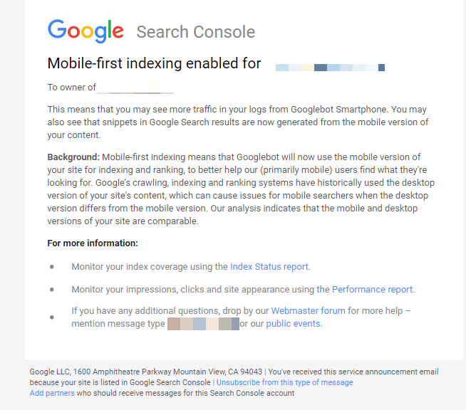
Mobile-first indexing means that Google will use the mobile version of the page for indexing and ranking. If you’re not providing a mobile version, you might lose some ranking positions; no more high rankings, and decreased ROI. So, mobile first indexing can influence the course of ROI if you didn’t mobile optimized your website.
We’ve previously talked about the mobile first indexing and even created a guideline to help webmasters in the process and make the shift to a more mobile-focused index less painful and as safe as possible.
Conclusion
After seeing all the results, we can say with certainty that mobile e-commerce is growing faster than e-commerce in general. We found lots of benefits of mobile website and apps. There are lots of pros and cons for both categories, but if we were to consider the stats, mobile apps have a higher chance to bring ROI.
In order to make an accurate and valid decision, you should look at your needs and goals. After that, you can see if you have the means to implement any additional design, either an application development or website development.


Nice post. Having a versatile mobile-friendly website is essential for business development.
Working with a web design agency in New York and I can easily say that it is more beneficial to have both of them, because leaving either of the two out is like leaving a big chunk of revenue.
Very good